Unleashing
Art Exhibition: Graphic + Web Design | Visual Communication

Duration
19 weeks
Jan-May 2018
Team
Juan Carlos Santos
Emily Lin
Richard Jochum
Livia Alexander
Isin Onol
Eunji Lee
Tools
Photoshop
Illustrator
HTML/CSS
Contribution
Graphic Design
Web Design
Project Type
Internship
Unleashing was an exhibition highlighting the concepts of the American philosopher Maxine Greene that took place throughout the buildings and halls of Teachers College, Columbia University, in early 2018. Participating in it more than 20 artists from around the world featuring over 30 pieces of art. The exhibition also counted with artistic and educational workshops and events. As part of the team developing the exhibition, my primary role was to develop different types of communication materials to assist the visitors in their experience and get around the space and document the event.
Problem Space
At the heart of the challenges in developing the exhibition was that it was not in a traditional gallery space. Instead, in trying to “activate” the school, the show took place across several buildings and multiple floors that were not conventionally interconnected. Foreseeing that this would result in many lost visitors unfamiliar with the school’s layout; simple branding, iconography, and signage was used to help maneuver around the exhibition.
In addition a website was constructed to document and help visitors become aware of what was going on before their visit.
Design Response
Symbols and Color
To help visitors identify areas where the exhibition was going on within the school a symbol of three dots in a single line was utilized and placed on the floor.
The green color palette was chosen because it is a dominant color that manages to stand out fairly well within the halls of the university. As well, it is a subtle reference to Maxine Greene, to whom this exhibition was dedicated.

3 green color schemes considered for use
Typeface
Because of multiple factors such as that the exhibition was being held within a complex university space, theme, and that many of the visitors were going to be of an older age, a clean clear font was needed. Century Gothic was chosen because it was an elegant, yet modern, and easily legible font for signage.

Century Gothic font sample
Maps
Because of the large span and multiple buildings and locations that the exhibition took place within Teachers College, maps were necessary. Utilizing existing maps for the university, maps were created for each floor exhibition was on. Making use of the color scheme, buildings in which artworks were found were highlighted in green while areas that didn’t were kept grey. A path leading the visitors through the school and exhibition was also put in to simplify the visitors journey.
You can view the full exhibition map clicking the button below:

Example maps of the first and ground floor at Teachers College, Columbia University
Art Labels
Art labels were made for each of the exhibited artworks, containing the essential information of the piece and contained a site number corresponding to its ordered location. To help with wayfinding a QR code linked to a time-stamped video showing the path to the next piece was also included.

Art label signage used for the artworks throughout the exhibit
Posters

Posters created to advertise events that were part of the exhibition
With the exhibition being held at Columbia University, and with a large student body, the exhibition needed poster and flier formats that differentiated itself from most other events going within the University. To this extent I made the observation that the majority of advertisements for school for other events were printed on standard letter-size pages. Therefore a few things were done to help make us stand out more and garner more interest:
First
A large tabloid format was adopted to promote the exhibition’s educational events, tours and screenings, which would help give them more prominence among other posters and fliers by student and university organizations.
Second
A standardized modular design was utilized for each promoted event, providing a consistent and identifiable visual language that would help viewers recognize that these events were part of the larger exhibition happening around the university grounds.
Website
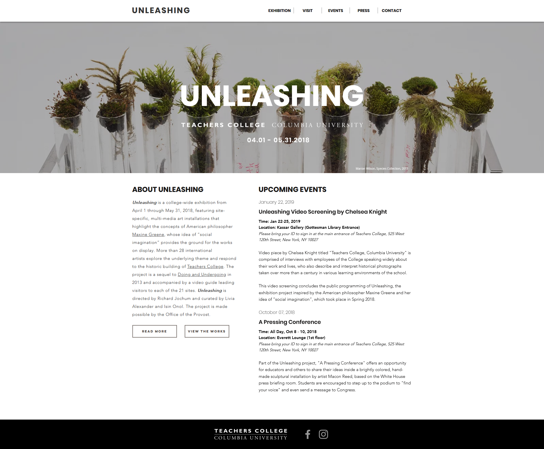
Landing page of the website
Landing Page
The website for Unleashing was developed in a manner that would allow visitors to know at first glance where the exhibition was taking place, what it was about and when other associated events were going on. To this extent, the website landing page features a large banner with the exhibition opening and closing dates. Below it, a small about section containing the essential gist of what it was about and a list of upcoming events with dates, location, and a short summary.
Browsing Artists and Sites
Because of the significant breadth of artists, art works, and installation sites, the core web experience was approached taking into consideration of what some individuals might be looking specifically for when entering the exhibition website. Particularly, whether the user was looking to see which specific artists were involved or what artworks were being shown and where. With this in mind, two distinct landing pages were created. Both accessible from the exhibition tab that would allow users to specifically look through the exhibition by artists or the sites where the art works were installed.

Browsing/gallery page for the exhibition’s sites

Browsing/gallery page for artists profiles
Artist Page
Upon clicking the desired artist, they are taken to the artist’s dedicated page which contains the traditional artist bio (provided by the artist). Below the bio are buttons that link to the site page that contains the specific art work that they are exhibiting. Depending on the quantity of artworks the artist provided to the exhibit, they may have one or more buttons linking to the different works.

Artist page containing artist’s profile
Sites Page
In a similar fashion to artist pages, site pages contained an artists description of their artworks located at each specific site. Each artwork description contained images of the work in its specific site, as well as a link to the artist’s bio page. Additionally, at the top left of each site page, information as to where the specific site was located was placed to help users know where to go in the university buildings to see the work in person.

Sites page containing details of artworks in the exhibition site
Interconnected
Ultimately, these aspects of the website were designed to be interconnected and to flow seamlessly between each other. The intention was to allow the users to explore the sites, artworks, and artists with ease regardless of where they started.

Showing how the artist and sites pages link between each other
Reflection
While Unleashing was a small independently organized exhibition, I had many first-time experiences designing for it. In particular, designing for many visitors who did not know the space that an event was taking place in and one that hosted many other events other than ours. One of the hardest things was to put myself in the perspective of potential visitors who did not know the school layout well. However, doing so, helped me come up with simple and effective solutions that could help with the physical navigation experience of the exhibition.